
Screen Time on iOS is like ice cream cake: so full of promise, and yet also always so underwhelming.
It’s probably Apple’s most valuable software update to iOS or MacOS in the last 10 years BUT the interface is built like what I would imagine an Intro to UX Design student would create if they were given the assignment: Design The Most Annoying User Experience Possible. It’s full of little quirks and poorly construed details that make it possible to do what you want, but not easy.
But, even with its foibles, it’s an incredibly valuable tool for anyone who wants to spend less time mindlessly using their phone and more time getting stuff done. I use Screen Time a lot and I have a couple of little tricks that I think make it really valuable.
In this essay, I’ll tell you a little bit about how I use Screen Time and along the way complain relentlessly about where it falls short. We’ll focus primarily on how to set App Limits, how to configure your Downtime, and how to designate a Screen Time Secret Keeper to make sure you don’t circumvent the limits you set for yourself.
App Limits
First, let’s talk about App Limits.
These are limits on the total amount of time you can use an app (or a set of apps in a given way.) You’d think that Apple created Screen Time in such a way that makes it really easy to pick out the most distracting apps, set limits on them, and then go about your day. Right?
Wrong! Apple has made this mind numbingly difficult.
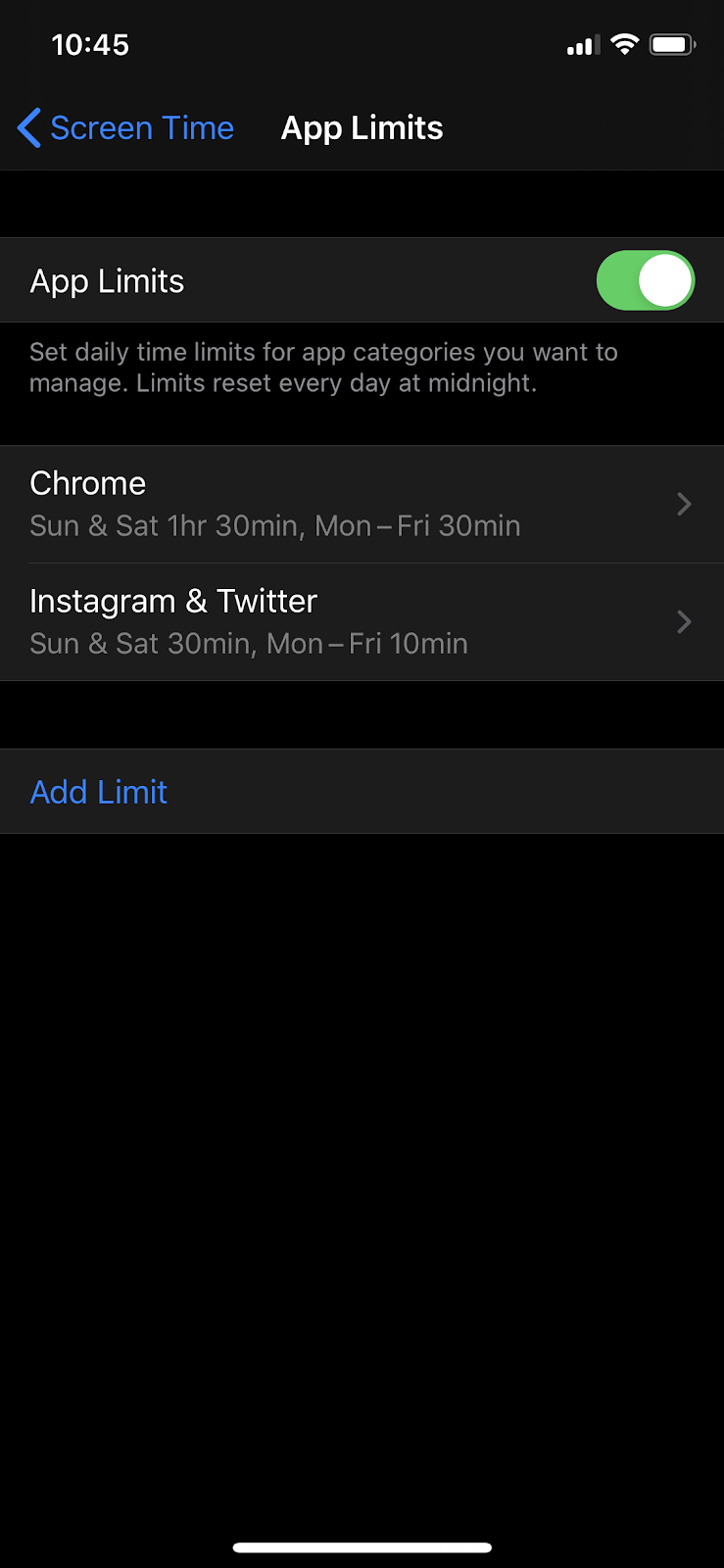
Let me explain. To set App Limits basically what you’ll want to do is go in to Screen Time, hit App Limits, make sure they’re switched on, and then hit Add Limit:
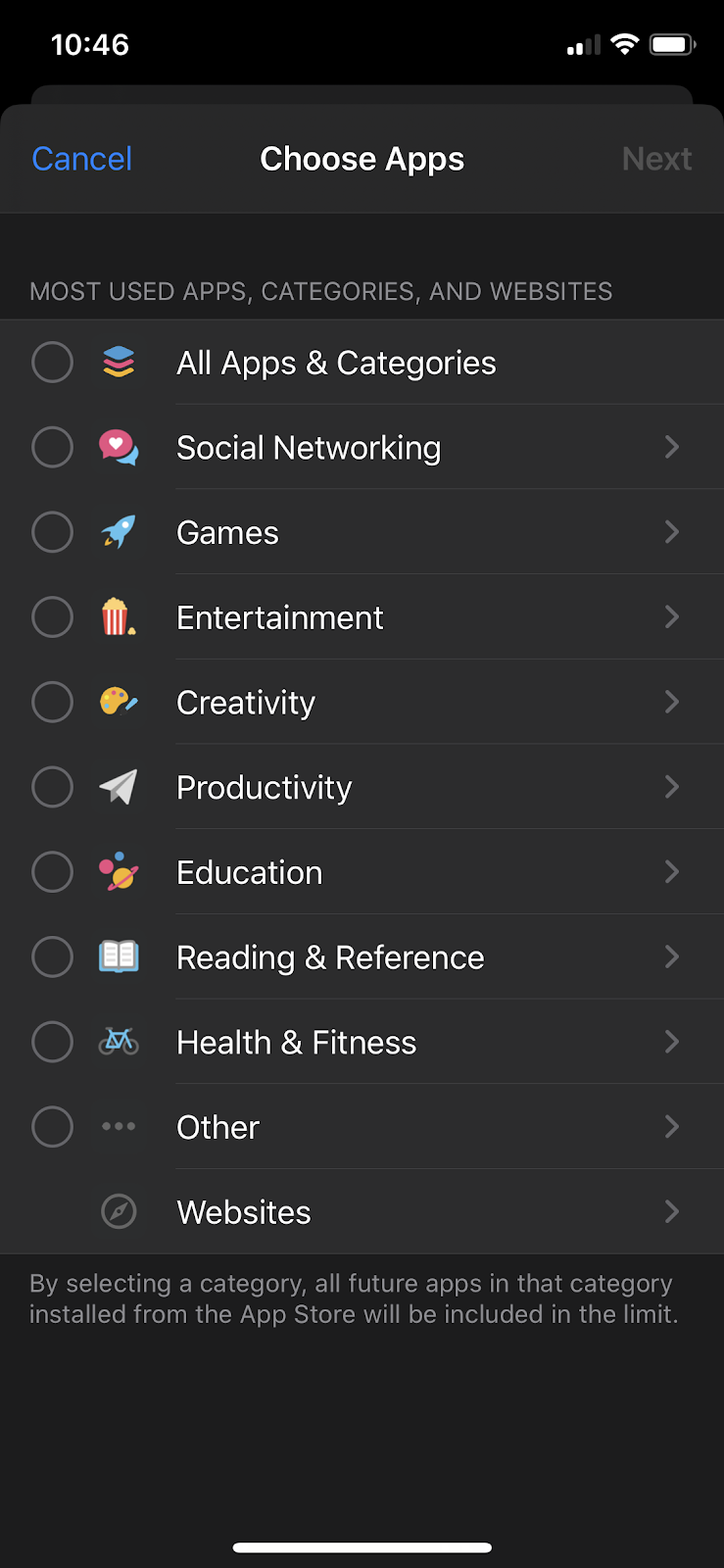
Then you’ll be presented with this screen:
You’ll notice that Apple had the bright idea to lay things out such that you can set limits on entire categories of apps like Social Networking. This should be convenient because most people will want to set limits on all of their social networking tools at once, right?
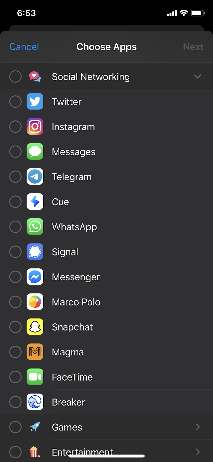
Wrong! The whole category thing doesn’t really work because, for example, listed in my “Social Networking” category are Twitter, Instagram, iMessage, and Breaker (a podcasting app.) Two of these are not like the others, Apple.
Even more maddeningly, when you expand the category to see what’s inside of it, the items contained inside are displayed the SAME LEVEL as the top-level categories. Look! Look! Inexplicable:
Also the categories aren’t organized alphabetically! They’re organized by some other unknown principle. (Maybe by screen time? Maybe according to Tim Cook’s mood? The possibilities are endless.) This makes it impossible to find what you want.
What you’ll want to do is ignore the category interface and swipe down to reveal the search bar. Then search for the apps that you want to limit.
What should you limit?
For me, any social networking app that I use regularly gets limited. The two most abused apps are Instagram and Twitter. So I set a limit on Instagram and Twitter (combined) for 10 minutes during the week, and an hour and a half on weekends.
That seems to me to be about the correct amount — I can mostly get my fixes in that time period, but it isn’t so long that I’m really sacrificing much productive time to them.
It also makes the weekends feel really luxurious because I can use these apps for what feels like an infinite amount of time while I laze around.
The other category of apps that I limit is browsers.
I limit my Chrome usage to 30 minutes during the week, which may feel too short. But I find that ~generally~ when I’m using my browser on my phone I’m not actually working I’m just goofing off, and so limiting my browser usage is useful.
I also keep Safari available (though I never use it) just in case there’s some sort of emergency and I really need my browser on the go. I find that because I’m not logged into any distracting things on Safari, like Twitter, that’s enough of a barrier for me to not think to use it when I want to waste time.
So the summary is: figure out what’s distracting you the most. Set a limit to something that feels uncomfortable but doable. Commit to revising these limits as needed — nothing is set in stone.
Once you’ve set your app limits, the next thing you’ll want to take care of is Downtime.
Downtime
Downtime is a great feature and it does pretty much exactly what you expect: it limits your screen time so that you stop using your phone before bed.
It’s powerful (because it’s a blanket block on everything on your phone) and pretty easy to set up: you can either set your downtime to be the same every day, or also customize your hours on a daily basis.
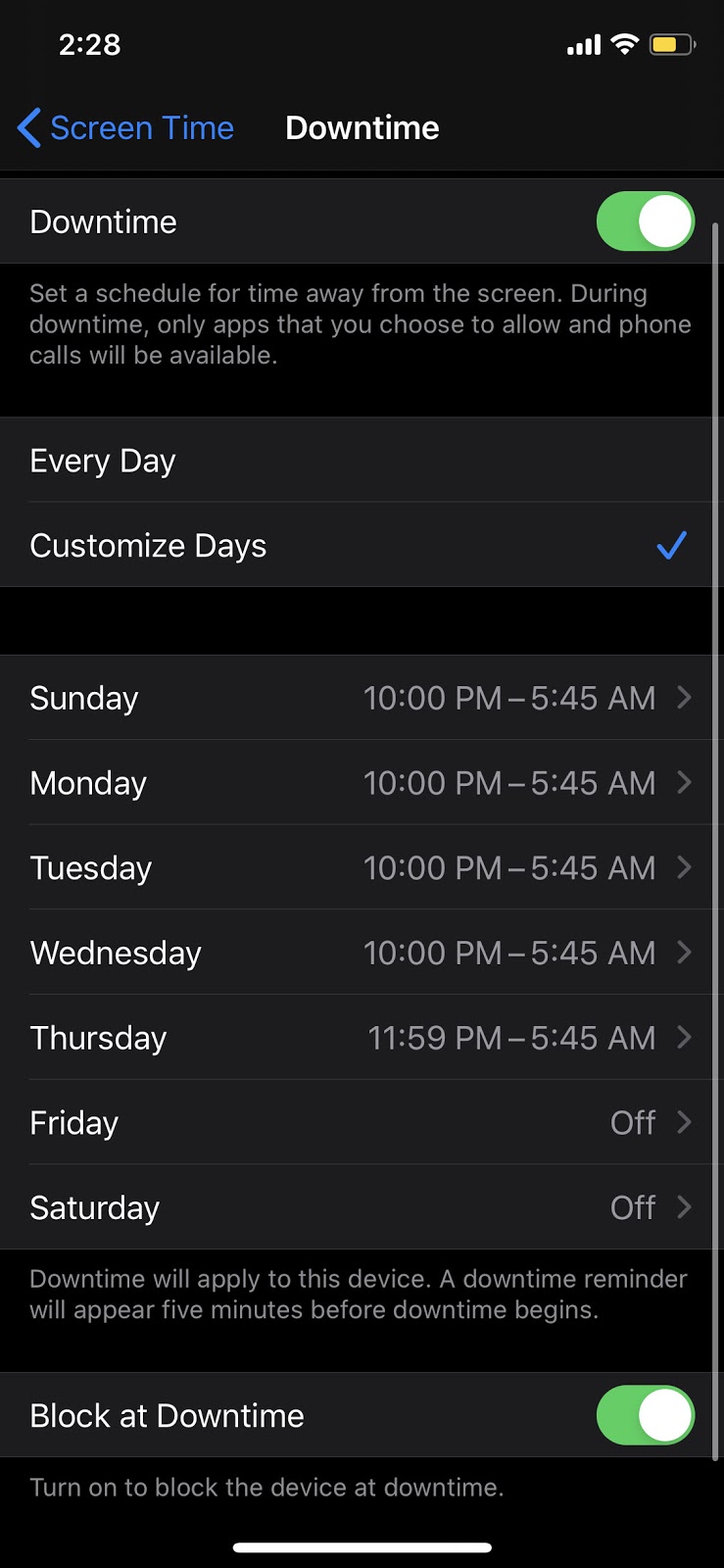
Here’s what my Downtime looks like:
I block everything starting at 10 PM and ending around 5:45 AM.
I do downtime at 10 PM because that’s approximately when I go to sleep. If I was being the absolute best version of myself I might set it to be like 9 or 9:30 so I have some device-free time before I close my eyes — but I’m not the best version of myself, are you? Anyway I set it for 10 PM and that seems to work.
The block comes off at 5:45 AM currently — but I’m not sure that’s actually the right move. I set it this way so that I could check my phone when I wake up. But recently I’ve been thinking about moving the block up to around 8 or 9 am, so I have an hour or two in the morning without any messages coming in where I can think and get ready for the day. I think that would be healthier.
You’ll also notice that these limits don’t apply on Friday and Saturday night because ain’t nothing keeping me down on my quarantine weekends, baby! (Just kidding I’m usually fast asleep shortly after it gets dark.) But it is nice to give yourself the option to stay up late with your phone on weekend nights if you feel so inclined.
The real trick with Downtime is to make sure you’ve set your Always Allowed apps. The thing to know is that using Downtime is like using a nuclear bomb — you’re laying fiery waste to every piece of your phone’s in-built functionality for the entire time period that Downtime is active.
The thermonuclear capabilities of Downtime are, of course, app-lethal by design but there are definitely certain apps that you’ll want access to at all hours. (Seamless, anyone?)
You can enable apps to “pierce” the wall that Downtime puts up, and be accessible at any time of the day by clicking in to “Always Allowed” from Screen Time.
Here’s a list of things I recommend always enabling:
- Messages (you may need to text late at night if you’re going to someone’s house for example)
- FaceTime
- Maps (you never know when you’re going to need directions)
- 1Password
- Uber and Lyft
- Meal delivery apps (if you’re into that kind of thing)
Some of the above are obvious, but there are a bunch of other ones that are really nice to have enabled (and REALLY annoying if they’re not):
- Calculator (you may not need it often but, BOY is it frustrating if this one isn’t available)
- Calendar apps
- Google Docs and Google Drive or any other note-taking or productivity-related app (sorry boss, I couldn’t edit that Doc because I was locked out of my phone)
- Any airline app (guess who has two thumbs and once almost missed his late night flight because of Downtime!)
- Spotify and Audible (sometimes late night tunes are important — you know, for the culture)
Once you’ve set your Downtime and your Allows Allowed apps you’re pretty much ready to rock.
Screen Time Secret Keeper
Okay, I know what you’re thinking. “Yeah, yeah I’ve done all of that, but I always just click through the little warning box that comes up and keep using my phone anyway.”
Right, I did too. Until I started using a Secret Keeper.
The name comes from Harry Potter — in the book, a Secret Keeper hides a piece of information inside of their soul. In real life your Secret Keeper just hides your Screen Time password in their brain, and promises not to tell you what it is without good cause.
Now, the first thing you need to do if you want to have a Secret Keeper is to have friends. Well actually, one friend. Or a significant other. Or a co-worker.
The key is to find someone who you see regularly, and who will help you stay committed to lowering your screen time.
The way your Secret Keeper will work is this: once you’ve set your App Limits and your Downtime, you will allow them to change the passcode on your Screen Time app.
That means when that annoying “You’re past your limits” dialog pops up, you won’t be able to get through it — you’ll be locked out. And only they will be able to let you back in — which they won’t do because they have your best interests at heart. Or they just enjoy watching you writhe in agony from Instagram withdrawal. Merit or malice — the system works either way.
Now, you should know, that the “seeing them regularly” thing is important. You don’t want someone who’s visiting for 24 hours from Venezuela to be your Secret Keeper. That’s because you’ll often want to modify your Screen Time settings after you’ve set them initially — and to do this requires your screen time passcode.
So make sure you see your Secret Keeper regularly so that you can ask them to unlock your phone and modify your Screen Time settings. This might be a little hard to do during quarantine, but you can always dead drop your phone on a park bench like a spy, and wait at a safe distance for your Secret Keeper to punch in the code for you.
In Summary
That’s it folks! Those are my best Screen Time tips (and complaints.)
The basic summary is this:
- Set App Limits to help keep you away from the most distracting stuff on your phone like social networking apps and your browser
- Use Downtime to help you be your best self, but make sure you allow the apps that you may actually need to use in a pinch
- Designate a Screen Time Secret Keeper to keep you honest about your device usage, and make sure you actually stick to your productivity goals
Do you do anything differently? Leave your thoughts and ideas in the comments.
The Only Subscription
You Need to
Stay at the
Edge of AI
The essential toolkit for those shaping the future
"This might be the best value you
can get from an AI subscription."
- Jay S.
Join 100,000+ leaders, builders, and innovators

Email address
Already have an account? Sign in
What is included in a subscription?
Daily insights from AI pioneers + early access to powerful AI tools




Comments
Don't have an account? Sign up!