
By Sidhartha Jha and Nathan Baschez
1
Once you see the pattern, you can’t unsee it:
Businesses are born simple. They attract early cohorts of users with equally simple needs. Then, as users get the hang of things, their needs become more sophisticated. So the business listens to its customers and adds complexity into the product. It’s a co-evolutionary process, where everybody is optimizing according to their knowledge and incentives.
This is great! It works almost perfectly for the business and customers that grow up together. But there is a problem, too.
As new cohorts of customers enter the market — because new businesses are formed, old businesses start using a new technology for the first time, or new generations of humans grow up and encounter new needs — they discover a lot of complexity that they’re not ready for yet. It’s daunting!
Their needs are simple, so they prefer to use simple products by new companies. Then they grow up together and become more complex. The cycle repeats itself.
Just like convection!
The goal of “Complexity Convection” is to give a name for the natural processes that drive so many companies up-market and leave them open to disruption.
Whether you’re investing or managing businesses, it’s important to understand these patterns and navigate the various traps and mis-aligned incentives that can arise as businesses age. And if you’re a founder starting something new, it’s extremely helpful to have a deep understanding of the weak spots that big companies often have.
So let’s get started. Just as Clay Christensen chose the disk drive industry to study patterns of disruption in the 70s, 80s, and 90s, today we can use the website builder space to see similar dynamics at play.
2
Imagine you run a local bookstore. Foot traffic has evaporated during the pandemic, your Quickbooks account is growing increasingly depressing, and you need to do something about it. So you decide to make a website.
You start by Googling it.
The first result you see is an ad for Wix. Fast, easy, and free? That sounds good.
*Click*
The page loads instantly, and fills your screen with an illustration of a stream that is somehow flowing directly out of the peak of a beautiful pyramid/mountain thing, which is unsubtly pointing directly at the “start now” button.
Eh, why not?
The site asks you a series of questions. What type of business is this? You start tapping out “booksto…” and it auto-completes it for you. Interesting. How many employees? Annual revenue? Do you want to sell stuff online?
You pick a theme, and hit “create”.
And wait a few moments.
And then a few more.
A page begins to appear, but it feels heavy, and slow. The keys grow warm beneath your fingers. Your fan spins.
And then… you have a website!
Now what?
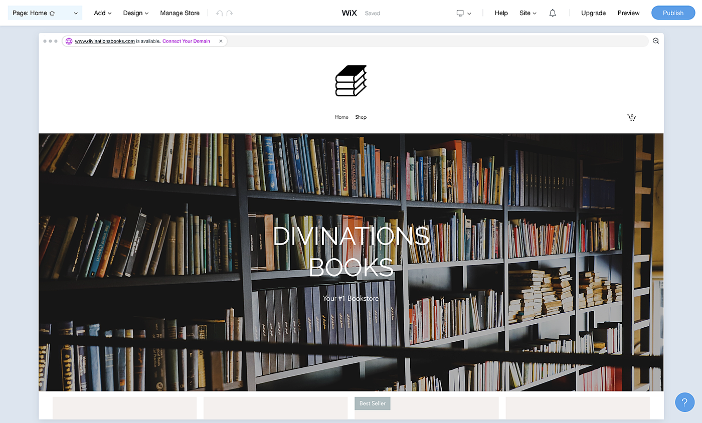
You swap out the background image. But now your name, “Divinations Books”, is not legible. Maybe you could move it to the left?
Hmm, there doesn’t seem to be a way to do that. Ok.
There are a lot of buttons and tabs and pop-ups asking if you want to sell stuff, asking you to upload “products”, asking you if you want to start a blog, etc. Meanwhile, your computer fan keeps spinning like it can barely keep up with the page. You just want something simple that looks good.
Click. Frown. Click, click. Scroll.
Wait! What’s this?
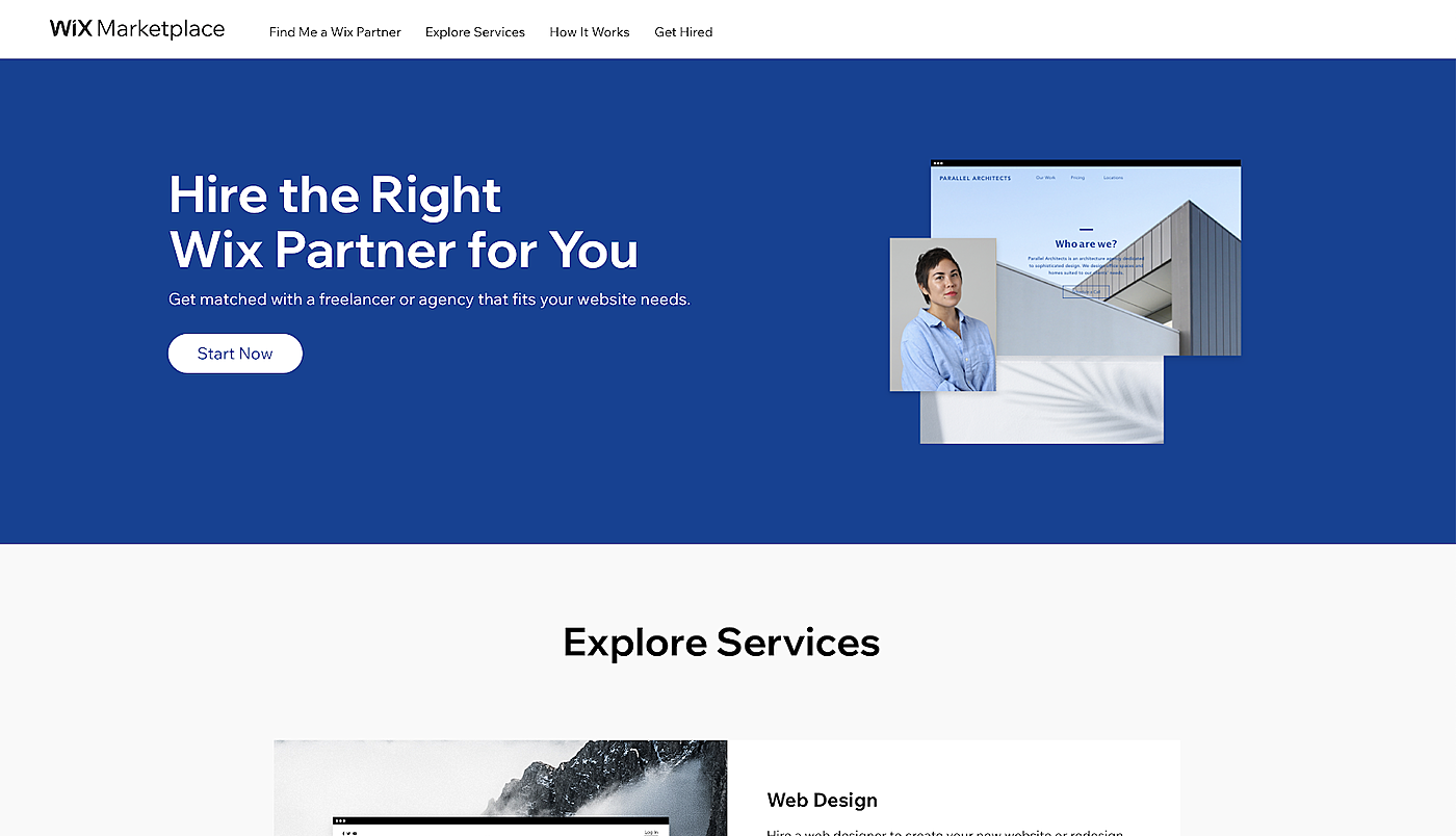
“Wix Marketplace — get matched with a freelancer.”
Maybe they can just deal with this for you? That could work.
You wonder how much extra it’s going to cost you…
Couldn’t they just make it simpler?
3
The story above is fictional, but commonplace. Coronavirus has forced millions of businesses online.
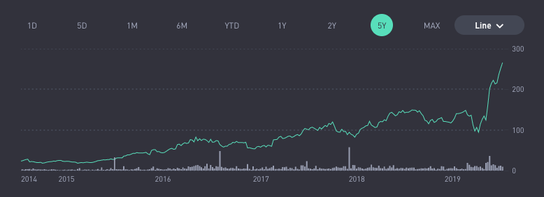
Naturally, Wix’s stock is up ~170% since April 1st.
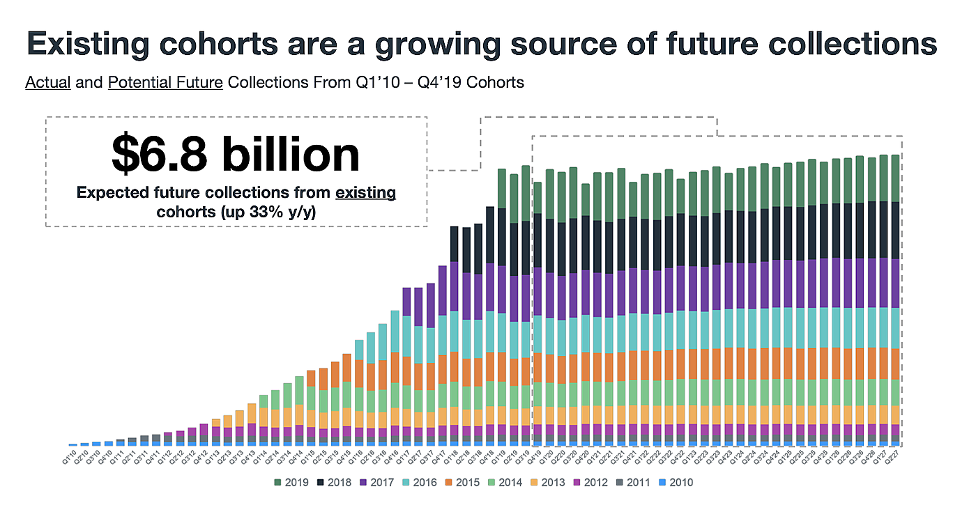
Coronavirus was a good boost, but website builders like Wix, Squarespace, and Weebly have always been compelling businesses. Everyone needs an online presence, and few customers switch once they’re on board. It’s a pain to make a new website. You’d rather just update what you already have and be done with it.
So Wix gets to put slides like this into their earnings decks:
There’s just one problem.
As the product grows more complex, it gets better for their long-time, most demanding customers, but it gets worse for new users with simpler needs.
So what can they do? Start over? That’d be a terrible idea. Their best customers need the advanced stuff. Fork the product into a simple version and a complex version? Splitting your focus is usually a bad idea.
Maybe the best thing is to just accept that the product is powerful and complex, and build a way for people to hire help if they need it.
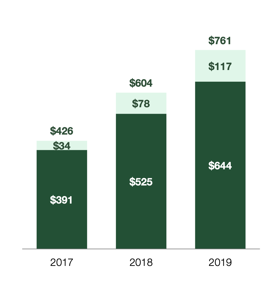
This is exactly what Wix did, and this business is the fastest-growing segment of their revenue, represented in the light green here:
The light green portion of the bars represent “solutions” revenue, which grew by 244% between 2017 and 2019. The dark green is their normal subscription revenue, which only grew by 64% in the same time period.
To be clear, Wix includes a bunch of stuff besides their marketplace in the “solutions” bucket. They have a payments product, a marketing product, and sell bundled access to G-Suite. We don’t know how much of this growth was driven by those products, and how much was driven by their freelance marketplace.
But, judging by Wix’s competition, it’s clearly a business model that works:
On the one hand, this is great, because it’s nice to be able to conveniently hire help when you need it. On the other hand, it’s a sign the product is too complex for some users. And it potentially creates some incentive misalignment.
Is it problematic for these companies to be making more money off frustrated customers seeking a work-around? At the very least, it exposes them to the inherent tension in the model of offering both a DIY tool and a freelance labor marketplace.
4
So why does this happen?
It’s not like there was a secret board meeting where the executives at these companies decided they want to turn up the difficulty level in order to extract more money from their customers.
There are a few reasons for this evolution towards complexity:
First, let’s acknowledge that it’s really hard to build a simple product that’s also flexible enough to create whatever you want in the first place. There’s some inherent complexity here that is difficult to overcome and should be expected. The only way to create a truly DIY website builder is to constrain the design to the point where users have very little control. This is a difficult trade-off.
Second, as the company's initial customers mature, they grow more complex needs. What was once a review blog for a cult favorite TV show turns into an e-commerce store that sells T-shirts with iconic quotes from the show. If the platform wants to retain its customers, it has to evolve with them and offer services like payments, storefronts, newsletters, etc. This applies to the design of the website as well. If an amateur videographer who just used to have a link to his YouTube channel but now wants to have an impressive experience with advanced animations for potential clients, the website builder needs to be able to offer that capability.
Third, fulfilling these complex needs for businesses has higher upside. The review blog might bring in subscription revenue, but that amount is capped at the annual cost of the subscription. On the other hand, there is no hypothetical limit on how much money the platform can make by taking a cut out of every TV shirt sale. Businesses also have higher budgets for re-designs from verified developers and plug-ins from third parties. The platform takes a cut of all of this.
Fourth, every successive cohort has weaker product-market fit. The very first customers of any product were looking for something exactly like that product. In this case, Wix’s early customers were looking for website builders with average complexity which are still easier than setting up a website from scratch. As the company continues to grow, it attracts customers that have less perfect product-user fit – customers with a higher skill mismatch to what is required given the complexity of your platform. To retain these customers, you need to move towards solutions like a developer marketplace.
Fifth, complexity increases stickiness and lifetime value of the customer. Website builders already have low churn rates, but complexity increases switching costs. if your website has custom solutions like plug-ins, specific designs, and payment integration, you’re even less likely to want to switch platforms because you’ll have to re-create all of that on your new platform of choice.
All these factors lead to a more complex product that’s serving more complex customers which are more lucrative for the company.
This is complexity convection.
5
The point of convection is that it is a cycle. It repeats itself. So, if it’s really true, we should be able to look back and forward to see companies at different stages of the complexity lifecycle.
And, at least in the website builder industry, that’s exactly what we see.
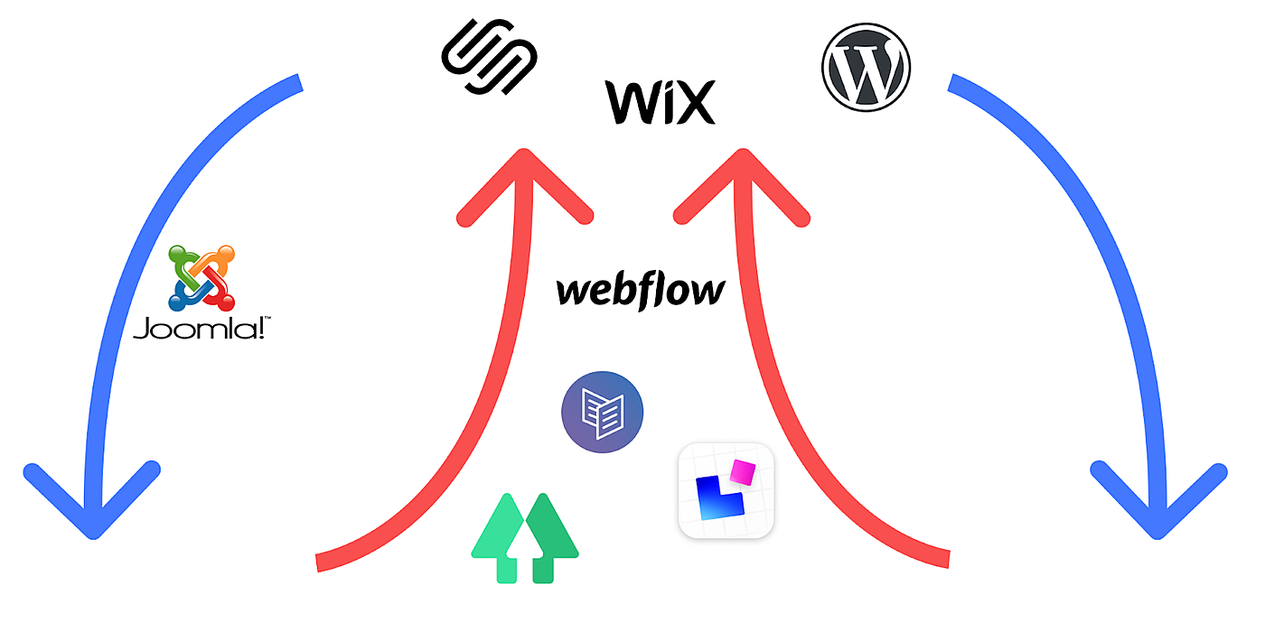
Wix and Weebly were created as simpler alternatives to Wordpress and Drupal. Now, they’re the complex ones. The market is being invaded by new entrants like Universe and Carrd. Somepeople even use Notion to build websites! And, for the ultimate simplicity, there’s always Linktr.ee. No website needed! Just the nav.
But of course, the pattern is not limited to website builders. You see it in a broad variety of tools, some more than others. Facebook gave rise to Instagram and Snapchat. YouTube gave rise to TikTok. Twitter, interestingly, resisted complexity with unusual intensity, and perhaps suffered because of it. But in the past several years it’s been steadily increasing.
At this point, it’d be tempting to conclude that complexity is bad, and businesses should resist it at all costs, because it damages their ability to serve new cohorts of users with simpler needs. But this isn’t the whole truth.
The thing about complexity is it works. It’s an inevitable side-effect of optimization. So the take-away is not that you should fight it at all odds. Instead, you should think of it like a delicate balance.
How do you preserve simplicity for new customers while increasing power for everyone else? It’s hard. But the more intelligently you can navigate this trade-off, the longer your journey upwards will be.
As far as we know, no business is immortal. But through new products and services it can continually renew itself, and it can resist the upward pull of complexity convection through smart navigation of trade-offs, and disciplined strategy.
How did you feel about this essay?
PS — You should follow Sid on Twitter and subscribe to his newsletter!
The Only Subscription
You Need to
Stay at the
Edge of AI
The essential toolkit for those shaping the future
"This might be the best value you
can get from an AI subscription."
- Jay S.
Join 100,000+ leaders, builders, and innovators

Email address
Already have an account? Sign in
What is included in a subscription?
Daily insights from AI pioneers + early access to powerful AI tools







Comments
Don't have an account? Sign up!